- Email: [email protected]
The Guru stickers project was a very exciting project that came around when the company’s founder Paul discovered us online. Paul was looking for some help with his Guru stickers book and he liked our marketing designs. He also noticed that we operate in both English and Spanish and the fact that he needed his stickers translating meant that we were the perfect fit for him! After contacting David and Manu at DM Media Solutions and having a few conversations and meetings, David and Manu decided to help Paul with his Guru stickers product.
One of the first things we had to decide was the size of the stickers and the kind of stickers that we would use. This was a fairly important step as it would lay the foundations of what the stickers would look like. Once we had decided the size and kind of stickers we wanted to use, then we were able to move on to the next part of the process. The next stage in the process was to find the kind of paper we would use for the stickers. After some back and forth and a little bit of searching we were able to find the perfect paper for Guru stickers.
The choice of paper was really important because the paper had to do two things. One, look great and appeal to the eye of customers and two, it would have to be easy to apply and take off so that the Guru stickers could be removed and stuck back again without causing any problems or leaving any residue. So after we were satisfied with the kind of paper that was chosen, we moved on to the next step. This was to work on the vocabulary and the correct punctuation for each word. The benefit here was that DM Media were able to speak both Spanish and English so with the help of Manu this made the translation process easier. However, there was still a lot of work to be done.


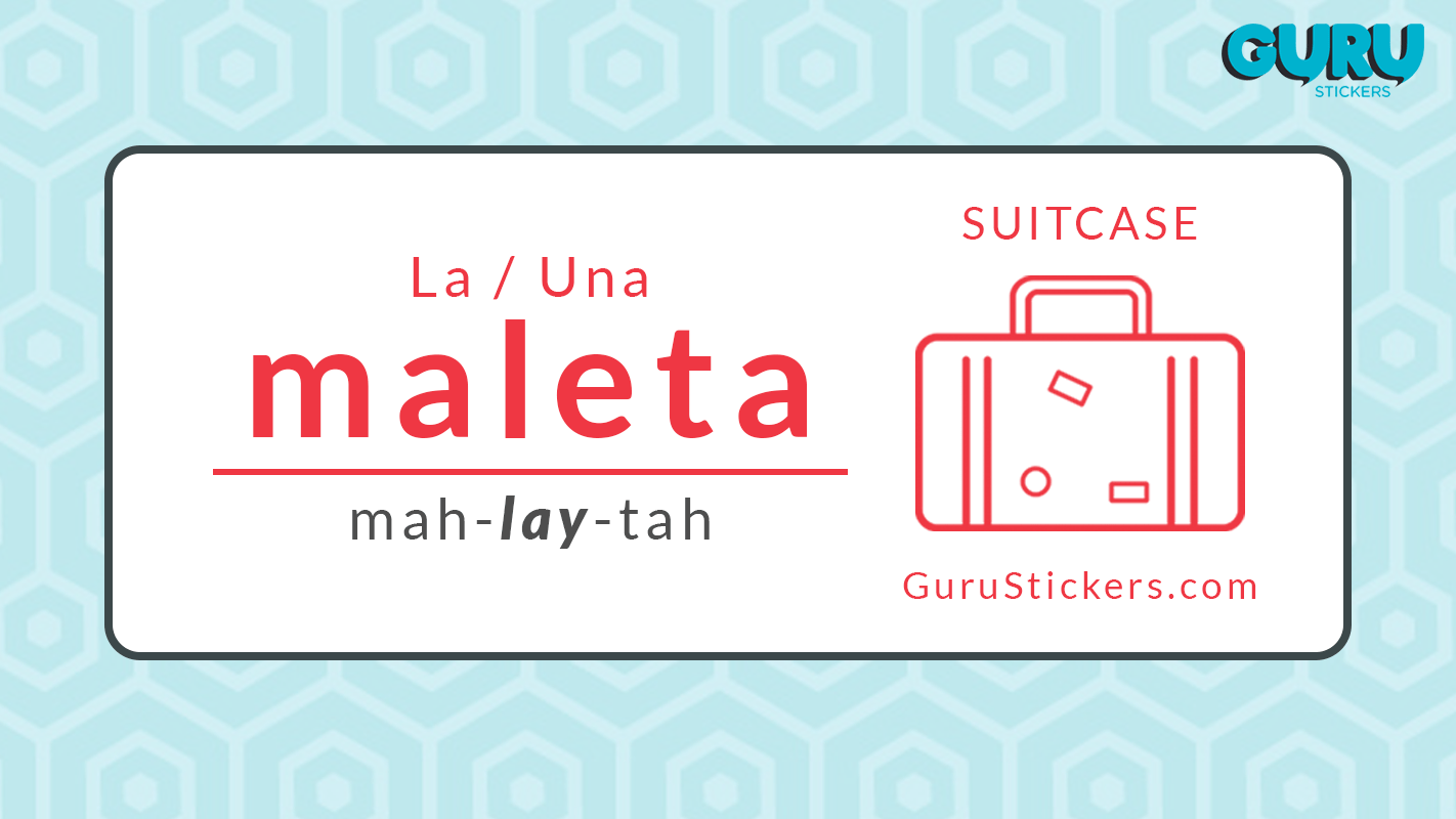
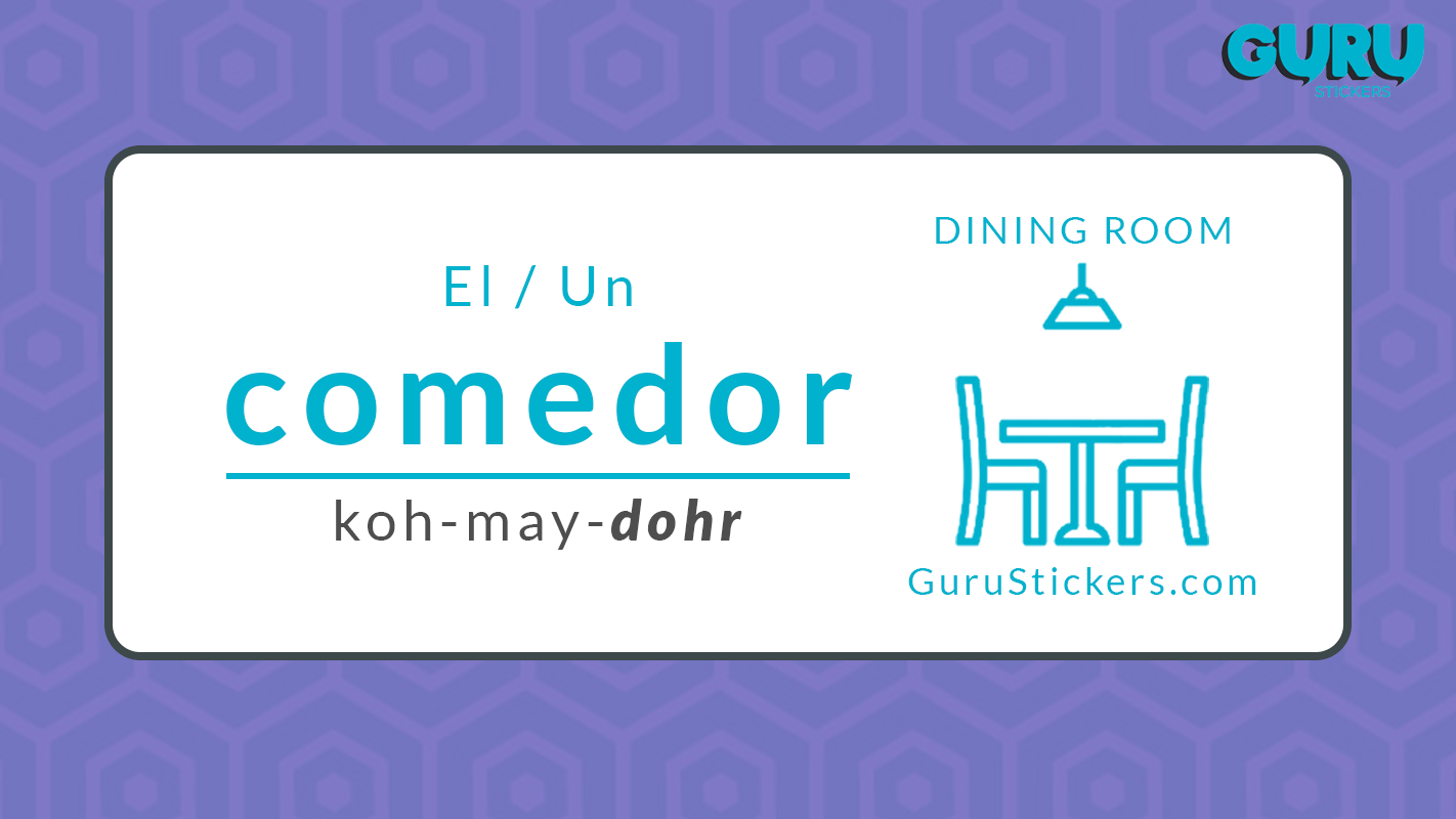
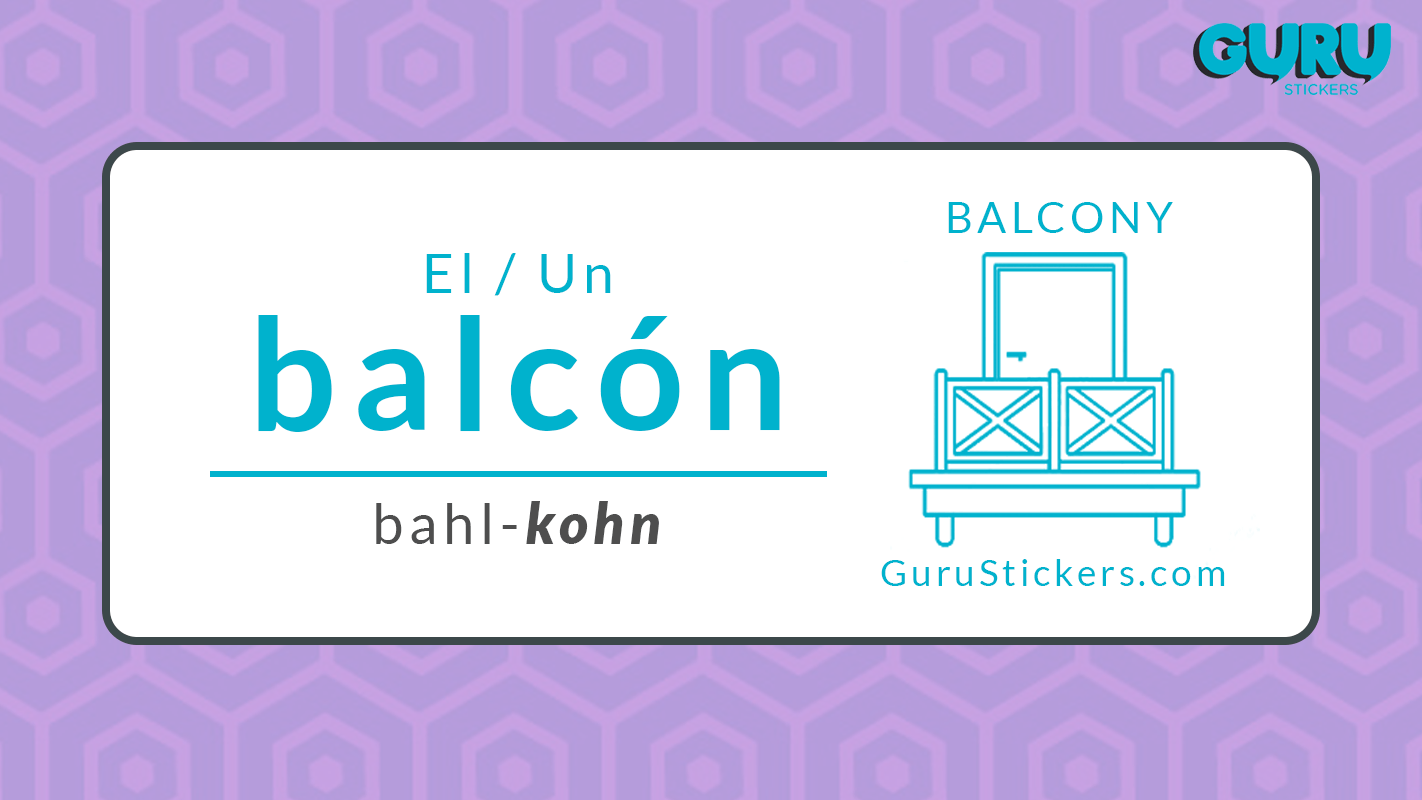
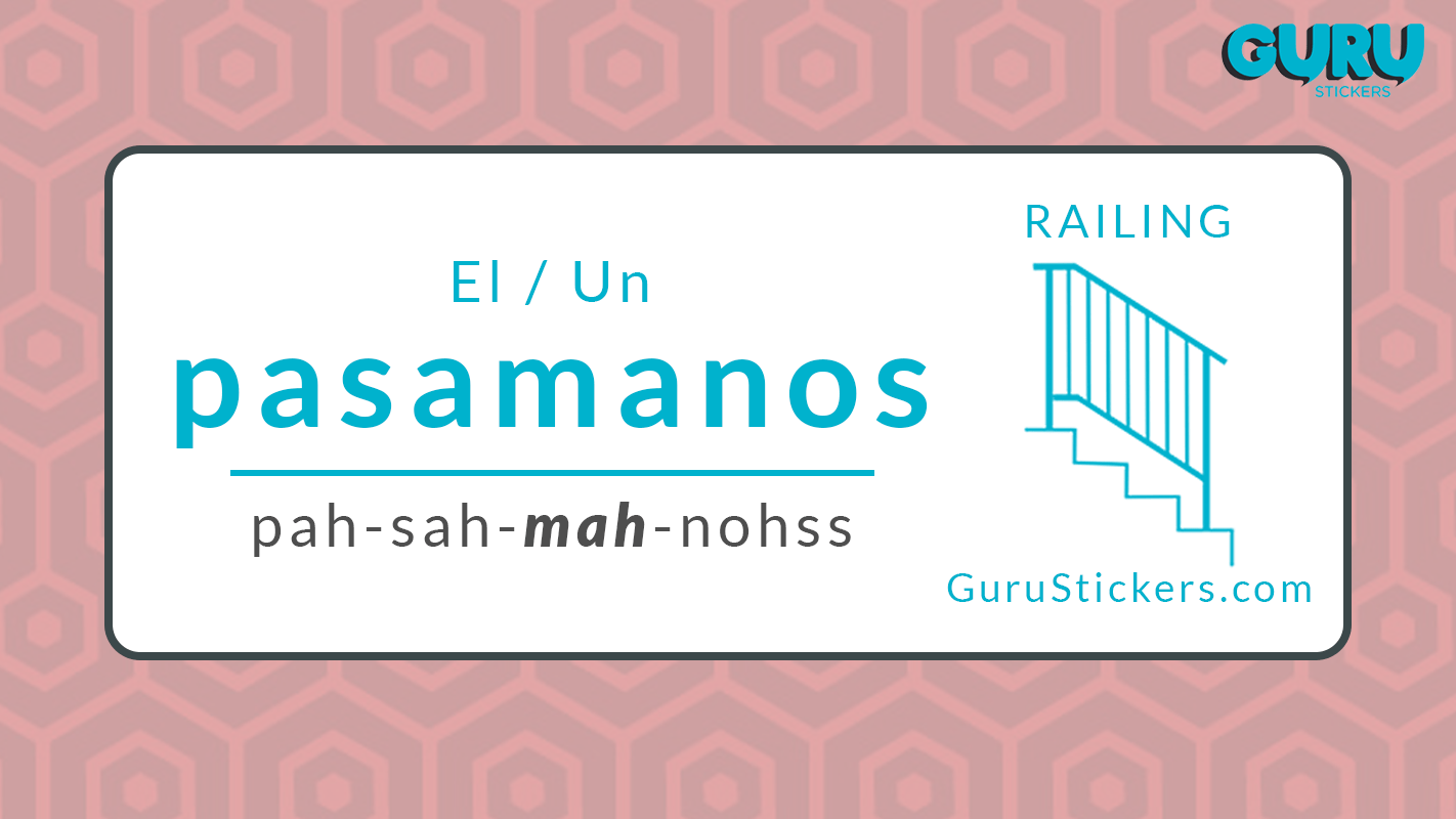
So DM Media went through each and every word that would be included in the stickers and checked for the correct spelling, punctuation and vocabulary. This task could have taken a lot longer but DM Media were committed to delivering Guru stickers great results and helping them with all 180 of their stickers. Guru stickers also needed help creating an icon for each of their cards. So once we had finished with the wording, we focused on that. For the colours of the icons, we decided that mainly a blue and red style would work best for the icons. Alongside the coloured icon, the relevant word was written using the same colour.
The reason we selected the red and blue was that it added a fun look to the icons and the stickers became clearer for customers because they could see what kinds of icons they were choosing. In addition to this, the simplistic yet fun style of the red and blue coloured stickers meant that it wasn’t confusing for customers. Finally, we decided that the front cover for the stickers should be a blue white and red colour. We added an eye-catching red strip running around the top, then below this, there were benefits written in white writing against a blue background which was in the style of a sticker peeling.
As it was a kid-friendly and adult sticker selection, we wanted the cover design to have a fun, friendly and appealing look to it which is why we choose the cover to look like it was a peeling sticker. Overall, the project came out pretty well and Paul was happy with the end product and end results. In the time that DM Media helped Guru stickers with their sticker creation, they have gone on to successfully sell quite a few of their stickers, and they have even collected quite a few reviews from happy customers too!
Project Details
- Completion Time: 3 Months
- Project URL: Guru Stickers Amazon Page
- Date: April 2018
Would you like a design this?
Are you ready to take your online presence to the next level? Book in a completely free strategy session with one of our website experts – we’ll discuss your current situation, your goals and explain the process to you.
