- Email: [email protected]
Coops and Hutches
Rebecca Dibben Proofreading
We were first introduced to Rebecca when she discussed doing some proofreading for some written content for DM Media. Once we got to know what kind of services she offered, Rebecca expressed that she was keen to get a website completed that she liked, so we decided that the best thing to do was to schedule an informal call to discuss what kind of website she was interested in. During our first call, it was clear to us that Rebecca wanted a website that could promote her proofreading services and showcase her services in the best light.

For the website, we wanted to have a lot of focus on the proofreading services so that new clients could see that she was an expert in her field. This meant that we kept the website quite minimal but we also included some of the accolades and accomplishments that Rebecca had in her proofreading expertise. We also wanted to focus on being more descriptive about the kinds of proofreading services that were being offered and this was reflected in the layout of the website.
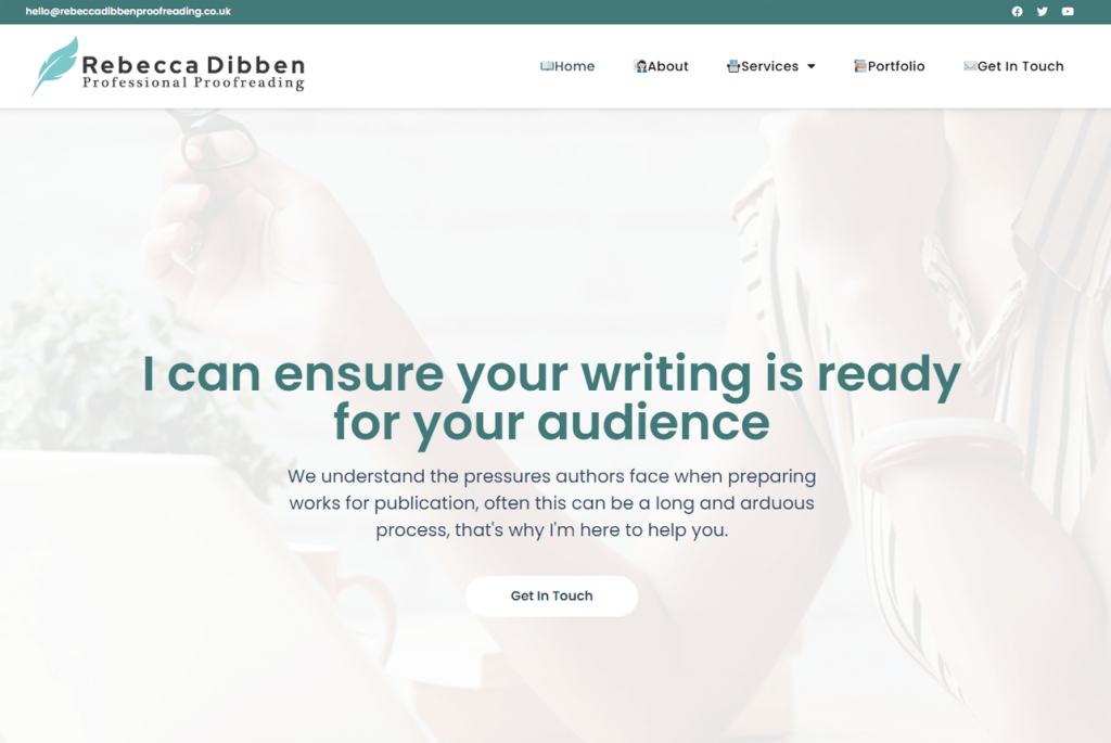
For the colour theme of the website, we decided to use a lot of white in the background. and for the writing, we went for a mix of turquoise, light blue, and green. These were great colours to use against the white background as they helped to put more focus on the words. At the top of the home page, we had a small amount of green writing that grabbed the attention of website viewers and put the focus on what Rebecca’s proofreading service could do for them and we also included a white ‘get in touch’ button. Below this, we included a bio that had some background on who Rebecca was, including who she was, her experience, and what services she offered. We also had a picture of her besides this bio and a green ‘get in touch’ button below this.

Underneath this, we had some of her qualifications and images of her accolades listed all in a row, these were all in blue so they went nicely with the white background. In a combination of green and black, we included a ‘what we proofread’ section detailing what kind of services Rebecca offered. This green and black writing combination against the white background helped to keep things more focused on the services and we also included a green button saying ‘how to work with me’. Below this, we had two more sections, one was for recent projects and the other was for recent testimonials.

We kept this part very clean and simple so website viewers could browse freely. In addition to the home page, we also had 4 other pages, one was an about page, another was a services page, the next was a portfolio page and the last was a get in touch page. Beside the link to each page, we had an emoji that was relevant to what kind of page they would be clicking on. This was a small detail that helped make the website stand out a little bit more, making it more interesting, and grabbing the attention of new website viewers.

Overall, Rebecca’s website turned out to be a great step in the right direction for her and her business. The website helped to position her as more of an authority in her niche and it built credibility for her. The website was also a great way for her to showcase her portfolio to new clients who asked to see some of her work. Once we created the website for Rebecca we knew that it helped to give her more of a professional image and she expressed that she was satisfied with it and liked it.
Project Details
- Completion Time: 4 Weeks
- Estimated Price: £600 - £900
- Project URL: Rebecca Dibben Proofreading
- Date: April 2022
Would you like a website this?
Are you ready to take your online presence to the next level? Book in a completely free strategy session with one of our website experts – we’ll discuss your current situation, your goals and explain the process to you.
